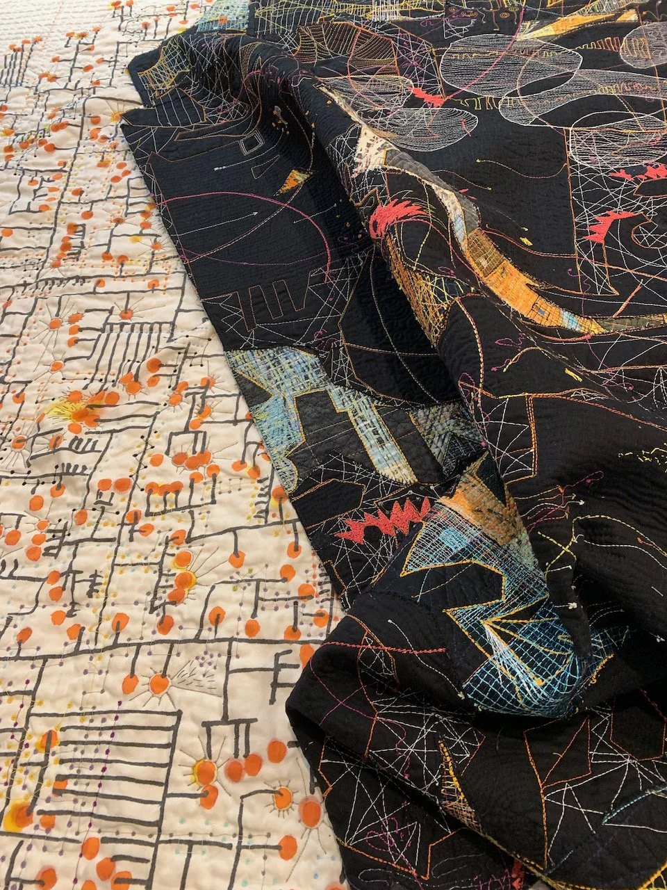
details

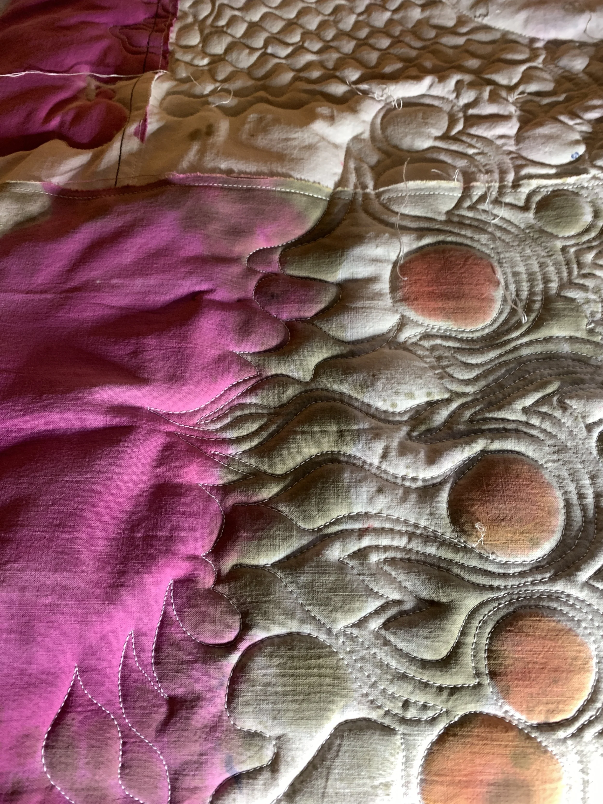
Working on the last bits of a piece can be like standing in line at a government bureaucracy. Tedious buzzing calculations — how many more stitches for that one last line of stitching? Will the employee behind the counter tell me I am in the wrong line after standing (im)patiently for an hour in the first line? Can the exhibit use a staple gun to put my piece up instead of me having to stitch a sleeve to the back?  Tedious buzzing reminders that this is a slow art.

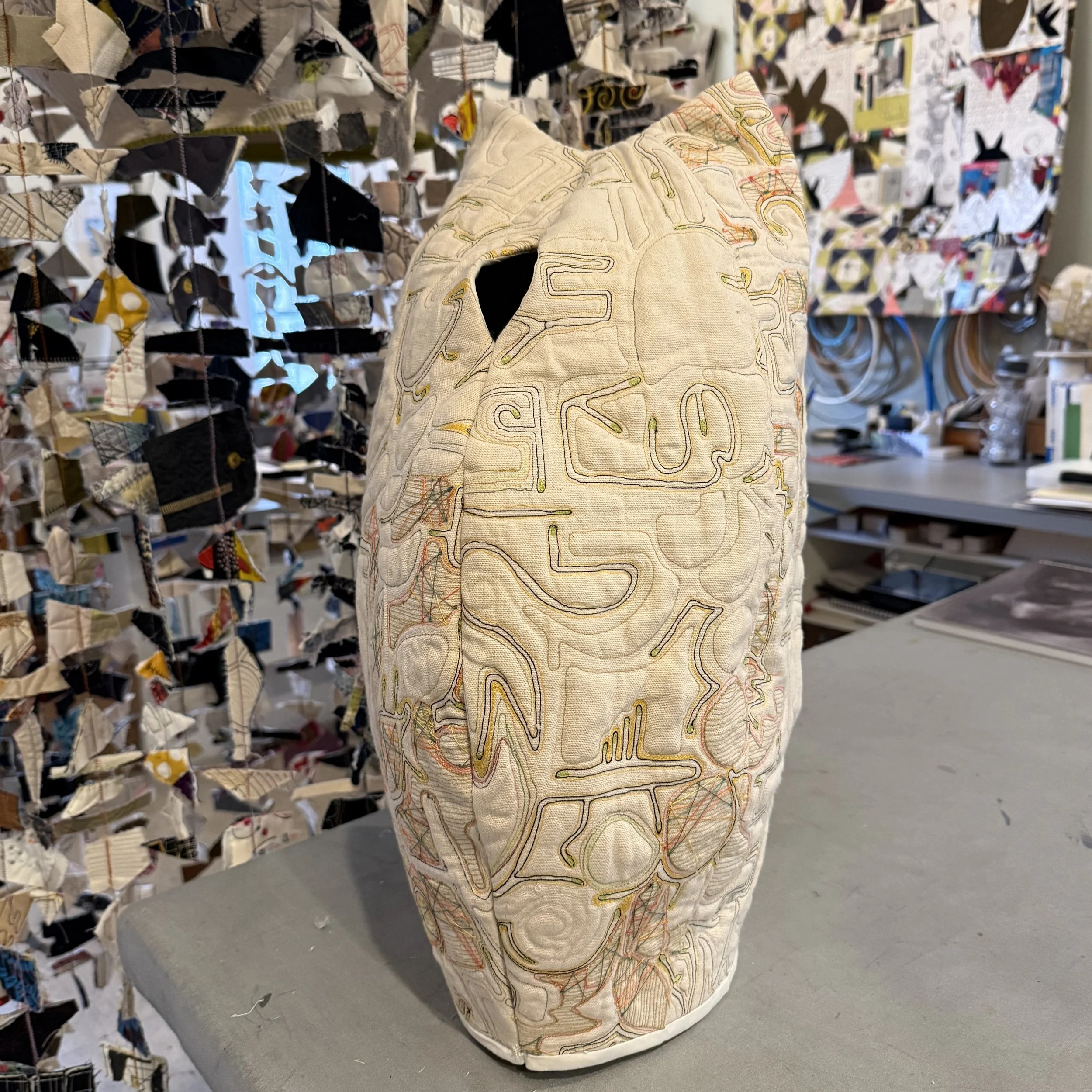
Tying this piece every two inches with crochet thread has given it a new dimension as well as a blister on my left middle finger.

Tying this piece every two inches with crochet thread has given it a new dimension as well as a blister on my left middle finger.

I start to question my sanity when I work on little details for days on end and then tear half of them away. Or when I decide to add another layer to an already complicated collage. Is this layering saying something about my state of mind? Short answer: yes.

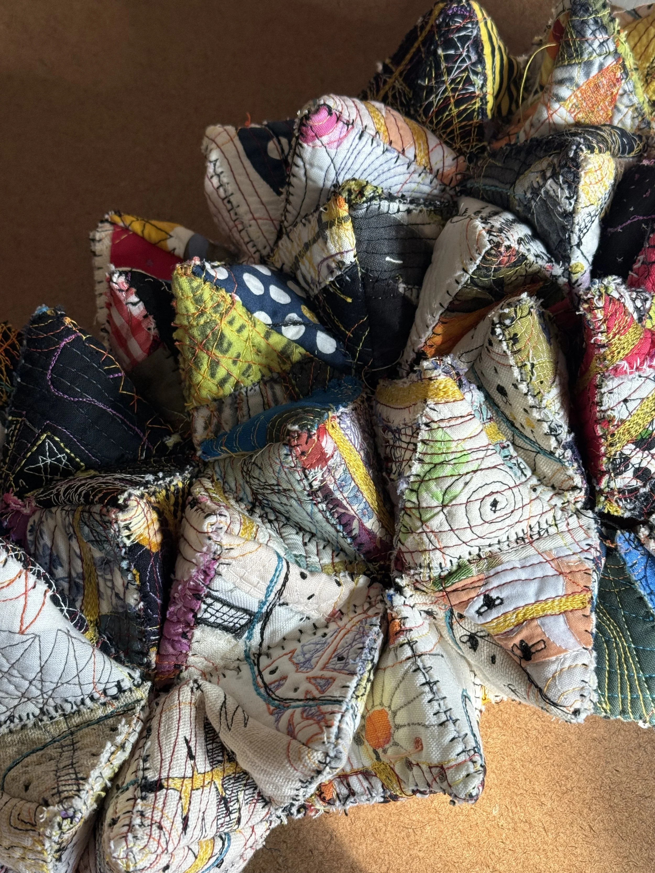
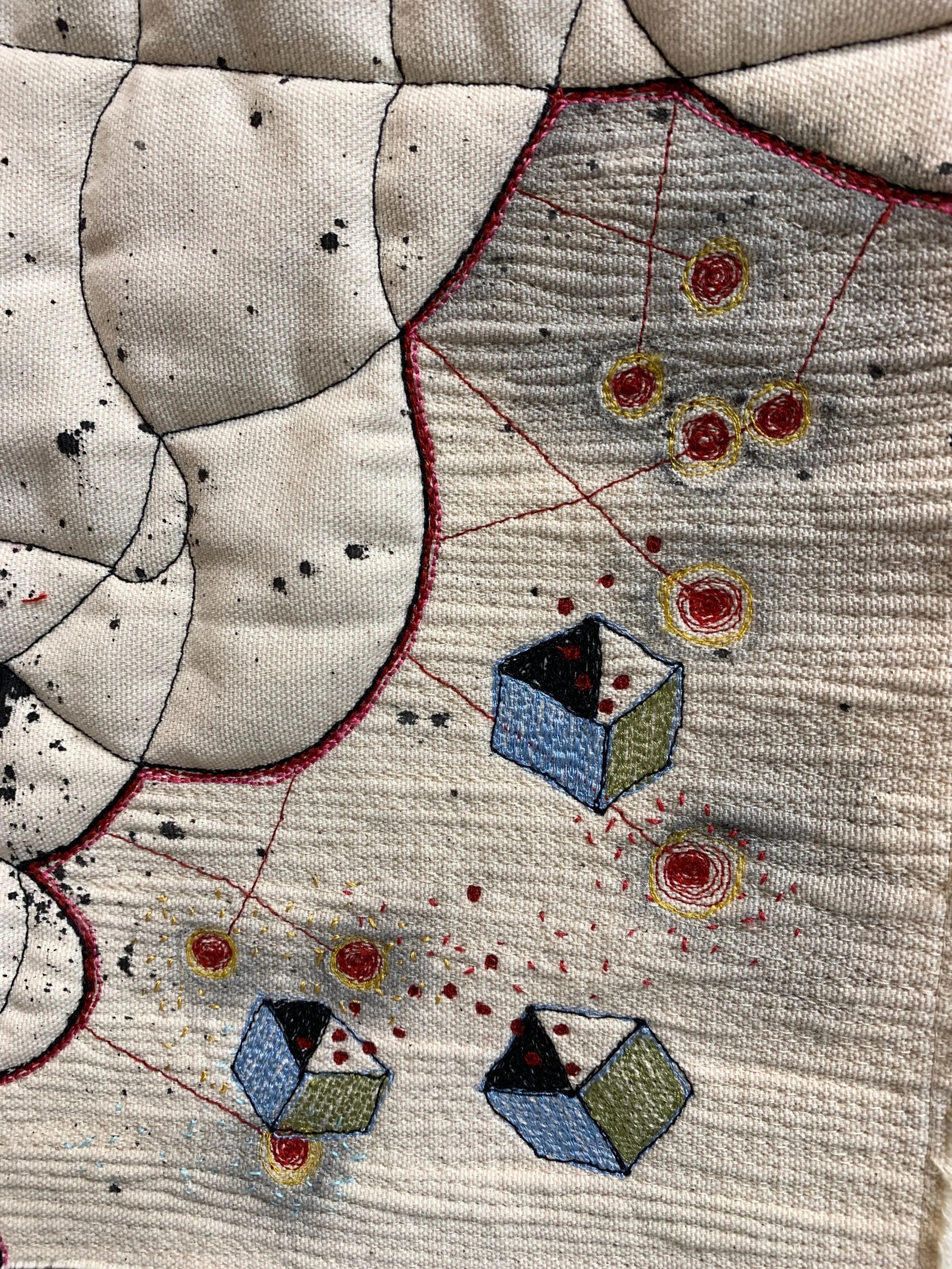
Pollinators is an assemblage of details tied together with details.

Pollinators is an assemblage of details tied together with details.

The rewards? Meditation, escape, complexity, depth, and mystery. I let the thread lead me.

This piece on nuclear arms testing had to have some olive branches drifting to the edge.
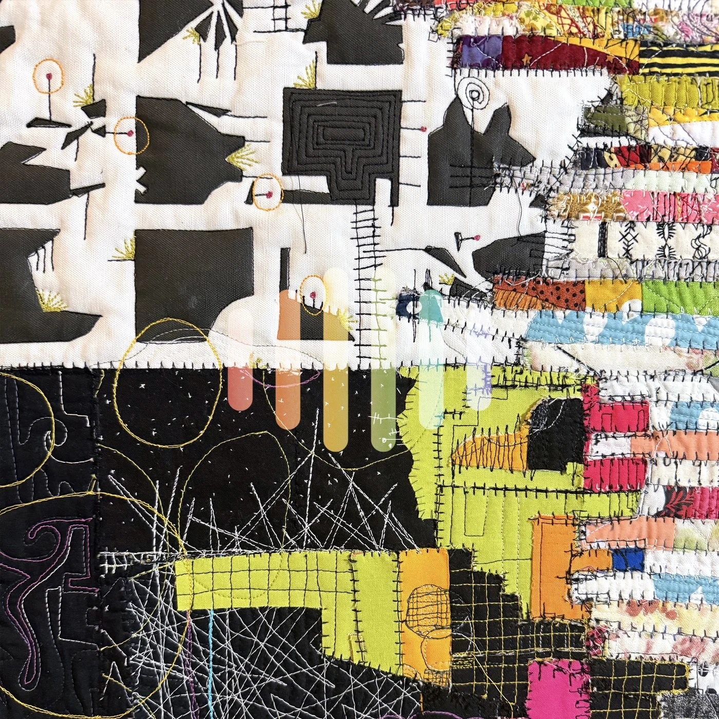
This piece on nuclear arms testing had to have some olive branches drifting to the edge.
Breakthrough

Threw away the fence. 

Tulle fence, Paula Kovarik

Tired of forcing it. Then I went to yoga and had a vision. 70 years of nuclear testing, 70 years of throwing radioactive junk into the atmosphere and water, 70 years of trying to figure out how we live in peace as neighbors. 

So I spent the day throwing blobs of acrylic ink at it. 

Japan, Paula Kovarik

I'm feeling much better. Thank you, Japanese artist Isao Hashimoto (click on his name to see the video he produced).

The fence will come in handy somewhere else. For now I am focusing on finishing.

All fenced in. Now what?

The completed tulle and silver thread fence for my refugee project is ready for final attachment to the piece -- which starts a new inner dialog. Is it too pretty? What the &%#! does it mean? And where do I go from here?

For some reason this simple cloth has challenged me at each stage (see other articles here and here). Should I do a map (again)? How does pretty influence meaning? What do other people see in the work? What did I mean by the piece in the first place? And the second place? and the third?

Have I lost the string?

The tulle and silver thread weaving creates the look I was after, a fence that supersedes the space it defines.

I think I am closer with this iteration. But I will still look at it with peripheral vision for a while just to be sure. I know this: It's too pretty. It may need to be three-dimensional. It may need to float in space. There needs to be strife. Meanwhile, some detail shots for your consideration. Tell me what you see?

These olive branches on the edges of the original tablecloth were part of the reason I used the cloth. I haven't yet figured out how they will connect to the primary image.

These olive branches on the edges of the original tablecloth were part of the reason I used the cloth. I haven't yet figured out how they will connect to the primary image.

building fences

Continued reading and research about refugee populations reveals a consistent discussion about building fences. To keep people out. To keep people in. Made of barbed wire, chain link, bricks and mortar or fabricated steel these fences are inhumane and daunting for those who seek safety, or food, or family. Whether it is between Mexico and the US or Hungary and Serbia the fences foster enmity, strife and violence. Guards with automatic weapons treat children as criminals. Countries stop talking about solutions and focus on defense. As these refugees encounter the barriers their lives are lost trying to find protection from thugs, food for their families, jobs for themselves.

As part of a study on this topic I am creating a piece that begins with a stitched tablecloth (see more about that here). I want to add a fence to the piece without obscuring the stitching beneath. I experimented with various materials including an actual section of chain link laid on top of the tablecloth (hmm...how to trim the edges?). I hand knotted a web of thread using a fisherman's guidance for fishing nets, in three different weights.

I built a jig that would allow me to string thread through a grid to create a fence of thread (which I thought I could hit with a solution of white glue to stiffen the gridded thread) and finally, I thought maybe I could just draw it on. None of these solutions worked. So the piece has lingered in my peripheral vision.

Until yesterday when I saw a collage by an artist who was layering textural elements over each other. The result looked like peeling paint. Not my goal. But the layering did spur an idea of how I could accomplish my goal of adding a fence to the piece.

Fences are solid, immutable objects that define space. But there are other types of fences that we erect that affect our lives. Those of fear, racism, anxiety and nationalism to name a few. Governments use laws and decrees to exclude or include. People sort their lives by choosing and defining groups that are acceptable and unacceptable to them. Voting districts are defined by those in power.

Fences can be solid or diaphanous, made of steel or made of prejudice.

I decided I would create a layer for this piece in progress. I printed out my drawing of the structure and taped it to a foam board. Layering the drawing with tulle that is stabilized on the back of the board I am weaving a silver thread through the tulle to create a subtle fence that can be cast over the stitched base.

We'll see if this works.

zooming in on inner sections

inner-sections, a work in progress. 2015, Paula Kovarik

inner-sections, a work in progress. 2015, Paula Kovarik

One of the best parts of any quilt is the fact that the closer you get the more you see. It's important to my art that people see a strong composition that reads from afar. But I also want to draw the viewer in to see details and depth.

This piece exemplifies that focus. The first layer is the piecing. The color scraps of fabric came together gradually to form this composition. It was done randomly, I knew only that I wanted a dark side and a light. (see more information about this process here)

Second, I focused on the intersections of the fabrics and stitched tangent lines at each seam in black and white across the piece. So, whenever two fabrics touched each other I separated them by stitching a line across the surface of the piece --black stitching on the white ground, white stitching on the black. My theory was that the overall composition would create hotspots of intersections where the seams would reveal invisible connections that a casual glance would not reveal. My theory seemed proven when I noticed nests of black lines between the two figures on the white ground.

Third, I decided to highlight the areas that formed triangles with green thread. This creates another level of dimension in the piece. Sort of like a floating superstructure.

zooming in reveals nests of stitching that are formed by the tangent lines and the floating green triangles that seem to hover over the piece.

Zooming in even closer reveals textural detail of the black on black stitching in the upper portion of the composition. This texture might be hard to see in this shot, very difficult to photograph. Adding this level of texture seems to complete the picture for me. I think I am close to binding this piece and trying another version.